HELP CENTER -> Design & styling
Make your pages look right on mobile, tablet and desktop
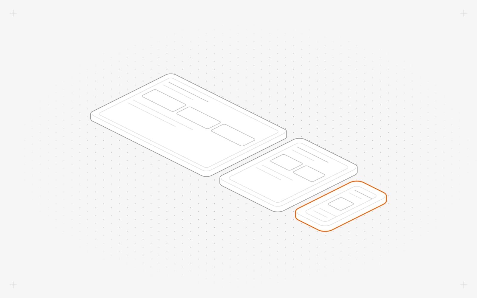
Preview a page on each screen
- In the page editor, click Mobile Screen, Tablet Screen or Desktop Screen in the top bar.
- The page redraws at that width.
Style a section for one screen
- Click Mobile Screen.
- Select the section and change a style, for example set Columns to 1.
- Click Desktop Screen and set the desktop value, for example 3 columns.
Limits
- Mobile values apply at every width, Tablet values from 768 pixels and Desktop values from 1,280 pixels. Laptops between 1,024 and 1,279 pixels wide show the Tablet values.
- Sizes, spacing, alignment, columns and gaps can differ by screen. Backgrounds, colors, card shadows and animations stay the same on every screen.
- A section can't be hidden on just one screen.
- The previews use fixed widths of 1,400, 800 and 380 pixels.
Common questions
Why does my laptop look different from the desktop preview?
Laptops between 1,024 and 1,279 pixels wide use the Tablet values. Set the Tablet value too.
What does a dash in a style field mean?
Nothing is set for that screen, so the value from the next smaller screen applies.
How do I see how my page looks in search results?
Click SEO & Social Preview in the top bar to see your search result and share card.
On this page
Preview a page on each screenStyle a section for one screenLimitsCommon questions
Prerequisites
Still have questions?
Ask Pixel in your dashboard. It can make many changes for you, or take you to the right screen. Our team can also help you plan, build or move your site.


